
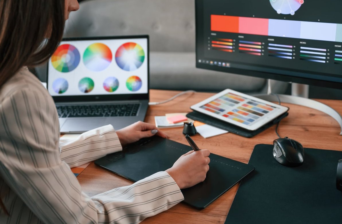
If you’re a graphic designer working from home, you already know the frustration: the vibrant purple you nailed on screen prints as a dull violet, or your Instagram post looks completely different on your phone. The culprit is almost always an uncalibrated monitor. The good news? You don’t need a $200 colorimeter to get impressively accurate colors. In this guide, we’ll walk you through how to calibrate your monitor for graphic design using nothing but built-in operating system tools and free software.
Why Monitor Calibration Matters for Designers
Every display leaves the factory with slightly different color reproduction. Panels drift over time, ambient light changes how you perceive colors, and default settings prioritize punchy visuals over accuracy. For a designer, this means:
- Prints coming back looking wrong
- Client feedback about “weird” colors you can’t see
- Inconsistency between your devices
- Wasted hours re-editing files
A properly calibrated monitor gives you a neutral, predictable canvas so what you see is closer to what everyone else (and every printer) sees.
Target Settings Before You Start
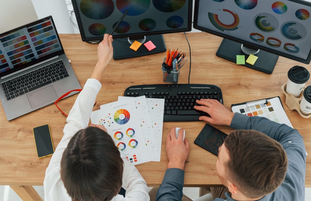
Before touching any tool, know what you’re aiming for. These are the industry-accepted baselines for graphic design work:
| Setting | Target Value | Why |
|---|---|---|
| Color Temperature | 6500K (D65) | Neutral white, standard for screen work |
| Brightness | 80 to 120 cd/m² | Matches typical print viewing conditions |
| Gamma | 2.2 | Standard for web and most print workflows |
| Color Space | sRGB (web) or Adobe RGB (print) | Depends on your deliverables |
Step 1: Prepare Your Workspace
Calibration is worthless if your environment fights you. Do this first:
- Turn on your monitor and let it warm up for at least 30 minutes.
- Set your room lighting to what it usually is during work sessions. Avoid direct sunlight or lamps hitting the screen.
- Clean the screen with a microfiber cloth.
- Set your desktop wallpaper to a neutral gray (RGB 128,128,128).
- Reset your monitor to factory defaults through its OSD menu.
Step 2: Use Your Monitor’s OSD Menu
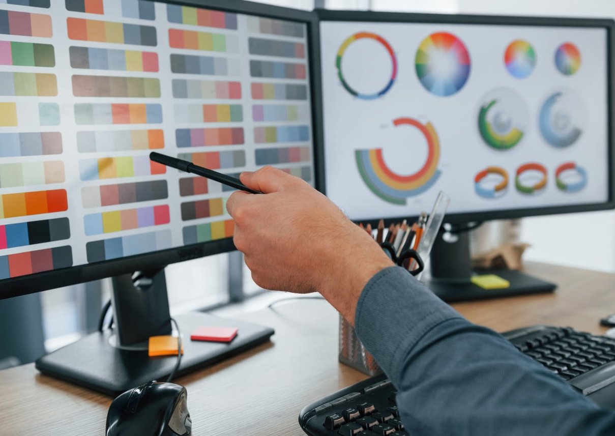
Before software calibration, tune the hardware. Go into your monitor’s on-screen display menu and:
- Set the picture mode to “Standard,” “Custom,” or “sRGB” (avoid Movie, Vivid, or Game presets).
- Set color temperature to 6500K or “Warm.”
- Disable any dynamic contrast, blue light filters, or auto-brightness features during calibration.
- Set contrast to around 70 to 75 percent as a starting point.
Step 3: Calibrate on Windows 11
Windows has a built-in calibration wizard that most designers overlook.
- Press Win + S and search for “Calibrate display color,” then launch dccw.exe.
- Follow the wizard through gamma adjustment. Move the slider until the dots blend into the surrounding bars.
- Adjust brightness using the reference image so you can see the shirt against the suit but the X remains barely visible.
- Adjust contrast as high as possible without losing wrinkles and buttons on the white shirt.
- Balance color by moving the red, green, and blue sliders until all gray bars appear truly neutral (no color tint).
- Save the profile with a clear name like “Design_2026.”
Compare it against your previous calibration at the end and stick with your new profile.
Step 4: Calibrate on macOS
Apple’s Display Calibrator Assistant is hidden but powerful.
- Open System Settings > Displays.
- Click Color Profile, then Customize, then the + button.
- Hold the Option key while clicking Continue to unlock expert mode with more granular steps.
- Follow the native luminance, gamma (set to 2.2), and white point (set to D65 / 6500) prompts.
- Save the profile with a descriptive name.
Expert mode gives you five tone response points to fine-tune, which gets remarkably close to entry-level colorimeter results.
Step 5: Fine-Tune With Free Software
The OS wizards are great, but these free tools take you further:
- DisplayCAL (still the gold standard for anyone with even a borrowed colorimeter, but also useful for visual profile management)
- Lagom LCD Test Pages (free online reference charts for contrast, black level, gamma, and color banding)
- Calibrize (a simple free wizard for Windows that some designers prefer over the built-in tool)
- QuickGamma (excellent for nailing precise gamma 2.2 curves)
Run through the Lagom pages after your OS calibration. If black levels, contrast, or gradients look off, revisit the relevant setting. This visual cross-check catches issues automated wizards miss.
Step 6: Verify With Real-World References
The final test is practical. Open designs you already know well:
- A previous project that printed correctly. Does it still look right on screen?
- Reference brand colors (open Coca-Cola red, Facebook blue, or your client’s logo).
- A skin tone reference photo. Skin is the most unforgiving test of accurate color.
- A pure grayscale gradient. Any tint (pink, green, blue) means more balancing is needed.
Limitations of Software-Only Calibration
Let’s be honest about what you’re getting. Visual calibration relies on your eyes, which have their own biases. You can expect:
- Good results for web design, social media, and digital illustration
- Acceptable results for most home printing
- Insufficient accuracy for high-end commercial print production or professional photography retouching
If you cross into paid client print work regularly, a budget colorimeter like the Datacolor SpyderX or Calibrite Display 123 pays for itself quickly. For everyone else, the method above gets you 80 to 90 percent of the way there for free.
Maintenance: Recalibrate Regularly
Monitors drift. Set a reminder to recalibrate:
- Every 4 to 6 weeks for daily professional use
- Every 2 to 3 months for occasional design work
- Immediately after moving your desk or changing room lighting
- After any monitor firmware or graphics driver update
FAQ
Can I calibrate a laptop screen the same way?
Yes, but laptop panels (especially budget ones) have limited color range and viewing angle issues. Follow the same steps, but keep expectations realistic. TN panels in particular will never match an IPS or OLED display no matter how well calibrated.
Should I use sRGB or Adobe RGB mode?
Use sRGB if your work ends up on the web, social media, or standard consumer printing. Use Adobe RGB or DCI-P3 only if you’re delivering to a professional print house that specifically requests wider gamut files.
Do I need to calibrate a factory-calibrated monitor?
Yes. Factory calibration is done in ideal conditions that don’t match your room. Even premium monitors benefit from a quick recalibration in your actual workspace, and they will still drift over time.
Will Night Light or f.lux affect my calibration?
Absolutely. Any blue light filter, night mode, or dynamic color feature will override your calibration profile. Disable them completely while designing, or set them to activate only outside work hours.
Is calibrating with just my eyes really reliable?
It’s not as precise as a hardware colorimeter, but it’s dramatically better than doing nothing. Most designers who skip calibration entirely have monitors that are 10 to 20 percent off in brightness alone. Visual calibration typically gets you within 3 to 5 percent, which is more than enough for the majority of digital and home print work.
Final Thoughts
Learning how to calibrate your monitor for graphic design doesn’t require an investment beyond your time. Spend 30 minutes going through the steps above, save your profile, and set a recurring calendar reminder. Your future self, and your clients, will thank you when colors finally start behaving predictably across every project.
0 Comments